Top Ten Tuesday is an original feature/weekly meme created at The Broke and the Bookish. Each week we will post a new Top Ten list. Everyone is welcome to join.
This week’s topic is:
Top 10 Covers I Wish I Could Redesign!
*These are in no particular order.
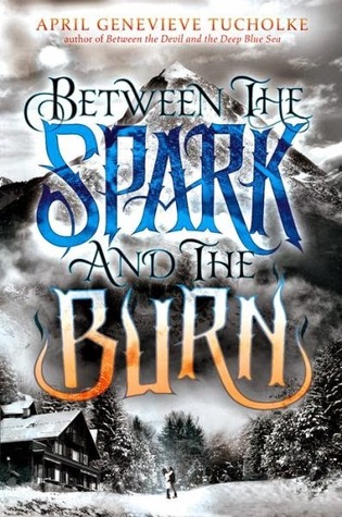
1. Between the Spark and the Burn by April Genevieve Tucholke: The background, I like… The font, I like… But the color of the font? Not so much. I just don’t like that orange.
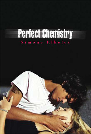
2. Perfect Chemistry by Simone Elkeles: How many of you just KNEW this would end up on my list?! I talk about my dislike for this cover all the time. I know it deterred me from reading it a long time ago and I’m sure its doing it for other people too. They have no idea of the amazing story underneath this cheesy, cliche cover.
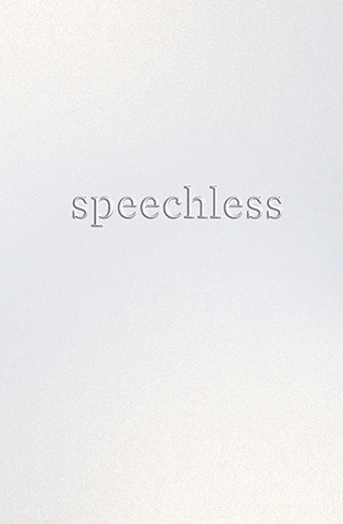

3. Speechless by Hannah Harrington: Ok, I get WHY this is the cover, but that doesn’t mean I like it. I know that every other book with the title Speechless has someone covering their mouth with a paper and they wanted something different, but just blank? Idk I would’ve done something else.
4. Vampire Academy by Richelle Mead: I KNOW I’m not the only one who thinks this cover model is Angelina Jolie lol I just don’t like it because its kind of creepy. Like her dopelganger is on the cover of a book lol
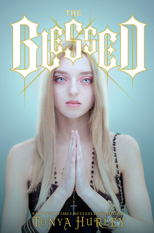

5. The Blessed by Tonya Hurley: For her to be a “martyr” as the synopsis suggests, she definitely looks creepy. Not gonna lie, she kind of scared me with those eyes.
6. That Boy by Jillian Dodd: I always thought the cover model on her other series was so gorgeous! And then this one looks like it was colored by an elementary student!
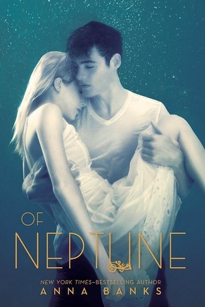
7. Of Neptune by Anna Banks: I thougt the first two covers were wayyyy better than this one. I’m not sure what it is, but I don’t like the extreme white wash thing they have going on. They look dead or something….
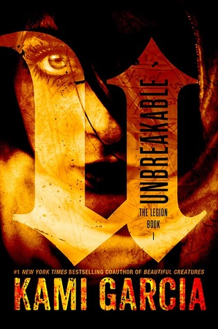
8. Unbreakable by Kami Garcia: Ok, this one is just weird. The book has ghosts and other scary happenings. The cover is like a cliche stock photo of a scary book…. Like they didn’t have anything else to use.


9. Ink is Thicker Than Water by Amy Spaulding: I just think that tattoo looks cheap. Like it doesn’t belong on her. I see it as if it was on an actual person, the font would be better and it wouldn’t be right there. But that’s just me.
10. Wildcards by Simone Elkeles: At first glance I thought he was choking her lol Simone Elkeles has the worst luck with covers smh
I know I’ve stepped on some toes because I know some of these are someone’s favorites, so sorry! Just stating my opinions! If you disagree, let me know what you do like about the covers and I’ll try to see what you see!
Nice picks! Agree that some could be redesigned! Never thought of it before but that Vampire Academy does look like a mini Angelina!
Here's my Tuesday Post
Have a GREAT day!
Old Follower 🙂
EEWWW the cover of Of Neptune.. Sooo bad.
I agree. DEEP BLUE SEA looked better. But it could be there's some awesome foil that will make this look amazing? I hate stupid, cliche romance covers that mask great books. Like Katie McGarry and Stephanie Perkins! UGH. I actually really like the cover for SPEECHLESS in person. It has a rough texture to it and looks really cool. It's not so blank in person! OF NEPTUNE does have a strangeness to it, butall the others have had that washed out look, too, so idk? A lot of covers I definitely agree with! Ugh, I hate when a cover makes a book look MEH!
I have Perfect Chemistry on my list too. She does have bad cover luck! I am glad to see someone else constantly rants about the same bad cover. For me it's Michael Grant's Gone books. I always complain about them! I haven't read Unbreakable, but I agree the cover is unappealing in it's oddness. Thanks for sharing! ~Megan
wp.me/pzUn5-1JE
Really great list. Perfect Chemistry series and VA made my list, think both covers are truly awful. I haven't read VA yet because of how awful the cover is, it really puts me off. I got the AJ thing too, she's a dead ringer! My TTT.
AHH yes, I so agree with you on Between the Spark and Burn. And I actually don't like the font, either, it's too cartoony or something. I'll be reading it anyhow, though! I loved book one!
I really like how the Perfect Chemistry series covers have scene from the book. I really like your list- those covers could do much better. And for some odd reason, although many people have picked Speechless- I love that cover. It's… yeah… speechless. Great list!
Thanks for stopping by my post earlier. Happy reading and have a great week ahead!
Sarika @ The Readdicts
. Between the Spark and the Burn is terrible! It looks so… not clean? 🙂
Great list! I agree with all of them!
Thanks for stopping by my post yesterday!
Happy reading!
Lis @ The reader lines